

Your home is supposed to be your sanctuary, so it should feel the way you need it to feel. Do you want to feel cozy and intimate or create a sense of vast openness? Do you want your home to be a relaxing oasis where everyone can feel an immediate sense of calm? Professional painters can help set the mood in your home. Here are ways color design can affect the home atmosphere.
Relaxation
Too many Americans are under stress due to work and other life issues, but with the right color palette from your local professional painters, you can feel at ease the minute you step through your front door or into a particular room in your home. If you want to create a relaxing and soothing environment in your home, choose colors that are cool, muted, or neutral. These colors can help reduce stress, calm your nerves, and promote relaxation. The most popular example of these types of colors is blue, especially baby blue, which is popular in bathrooms. Additionally, lavender isn’t just a beautifully scented flower; it’s also a beautiful shade of purple that can make any home create a sense of peace. As a third option, gray is considered neutral, but this neutrality can also help you relax even more, especially with added overtones of purple or blue.
Energy
On the flip side, you might be a little too laid back at times and need some pep in your step. To motivate you to be more energetic, warm colors that are bright and bold can do the trick. That’s why you often see children’s spaces decorated with such bold colors as they cater to children’s natural energy. If you’re building a playroom or entertainment space in your home, these colors are the best idea to use. You’ll feel an immediate boost to your mood and stimulation for your senses. Be careful, though, because your appetite might also be heavily stimulated, which is why certain restaurants often use such bright colors.
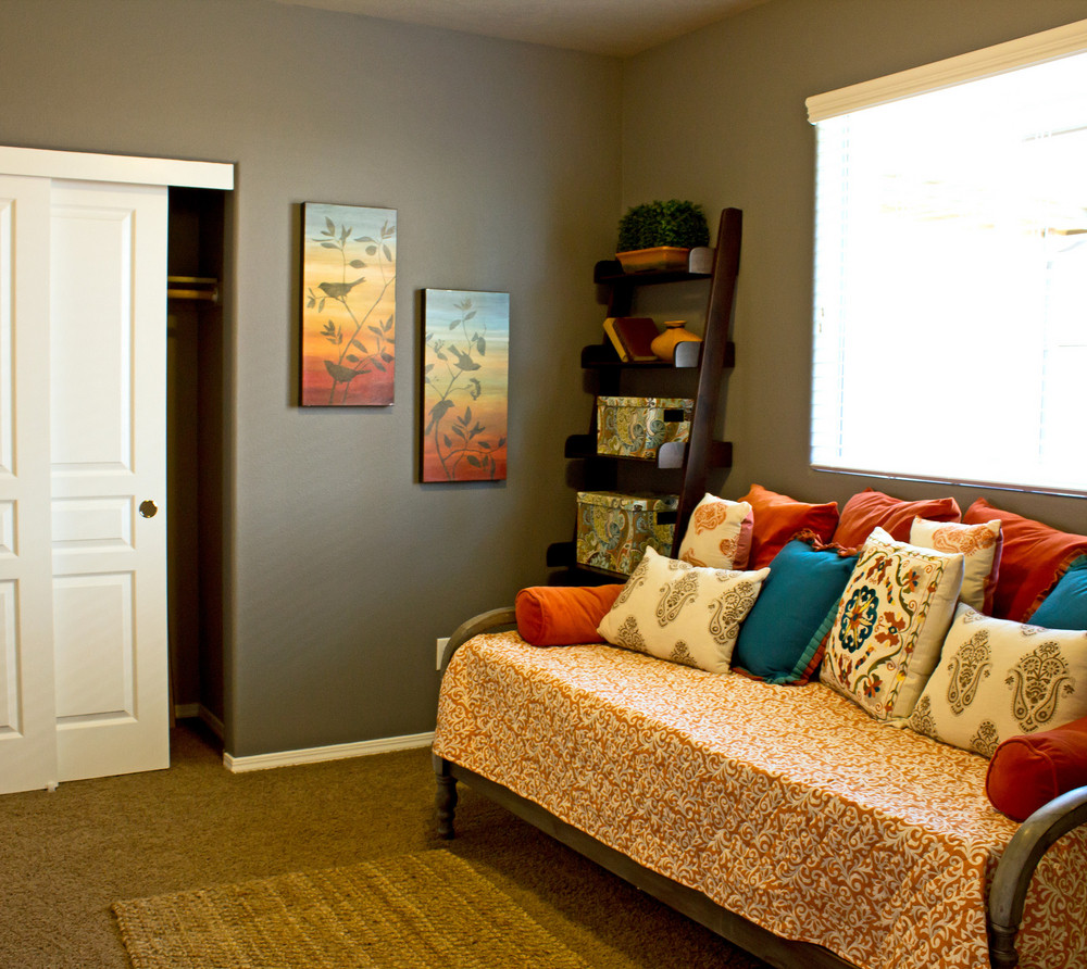
Restfulness
According to the Sleep Foundation, you should get seven to nine hours of restful sleep each night. Without proper sleep, you’re prone to developing inflammation, fatigue, cognition issues, and mood swings. If you’re having problems falling asleep, but your bedding is as comfortable as ever, the culprit might be your bedroom walls. As mentioned, certain colors can be highly stimulating, so it may not be a good idea to have super bright colors in your bedroom if you’re having problems falling asleep. Some colors can help you drift off to sleep more easily than others. Since colors like blue and purple are naturally relaxing, those are good options to consider to create a tranquil space that can induce sleep. According to a study by Travelodge, blue bedrooms tend to induce better sleep in people, along with yellow and green ones.
Hunger
If you’ve ever gone to certain restaurants, particularly those that might sell fast food, you may notice their use of bright colors. The use of such colors is no accident or coincidence, as these colors can stimulate your appetite. If you love to cook and entertain, especially as the holidays are coming up, you may want brighter colors in your living room or kitchen that can increase people’s desire to eat. Colors like red, orange, and yellow can make it easy to crave more food. However, if you’re focusing on weight loss as the new year starts, rest assured some colors also have the opposite effect of bright ones. According to a study by Cornell University, people who eat in red or yellow rooms tend to eat more than those who eat in blue or green rooms.
Sophistication
If you want to add elegance and sophistication to your home, you might want to choose colors that are dark, rich, or luxurious. You may want to focus on using such colors in your living room or dining room. Some examples of sophisticated colors are black, navy, burgundy, gold, and silver. These colors work well in terms of helping your furniture and other accessories stand out more so they can help show off the amazing decorative style that you have in your beautiful home.
Intimacy
There’s nothing like having some alone time with your partner. Maybe you want to enjoy some candlelight dinners or a nightcap after the kids are off to bed. You can achieve this effect by choosing cozy, warm colors like peach, rose, cream, tan, or pearl. These are colors that can help people feel more comfortable and bonded to the person that they’re with. If you want to create a sense of closeness, these are colors you can consider. Darker colors like black, dark brown, and dark gray can also help make your room feel smaller and more intimate.
Romance
In addition to intimacy, you may want to use some colors that kick things up a notch by symbolizing romance and love. Therefore, you should choose exotic, sensual, passionate colors that can ignite one’s emotions and stimulate the senses. After all, there’s a reason why red roses are considered the flowers of choice on Valentine’s Day compared to any other color or bloom. Work with your professional painters to see how colors like red, fuchsia, magenta, or chocolate brown can create the sense of romance you desire. And don’t forget about pink. After all, pink is a lighter shade of red and may work well for you depending on the room being painted.
Openness
If your home as a whole or a particular room like your kitchen is feeling too small, you may want to create a sense of space without having a wall torn down. Give your room or home a space of airiness with the use of white. Other very light or pastel colors can also create a sense of openness that can make you feel more free. The advantage of using such colors is they work very well when it comes to reflecting light. Light can bounce throughout your room when you’re using such a color with the windows open. These colors can reflect more light and make your space seem larger and more open. They can also create a sense of freshness and cleanliness in your home.
Happiness
Are you a happy person and want your home to exude that part of your personality? Professional painters can help you pick colors that are more cheerful and joyful. Ideal colors include pink, yellow, bright green, and shades of purple. Another happy color is orange, which is a festive hue that’s also associated with the autumn season.
According to Camille Styles, blues and greens are popular choices for home painting in 2023. Such colors may have been popular due to the mood that people wished to create, or maybe they were just someone’s favorite hue. Whatever the reason for your choice of color, don’t underestimate what qualified professional painters can do to make your home feel more comfortable and better suited to your personality. If you want to create a festive, happy, or calming mood, or exude an air of sophistication when entertaining, let your professional painters get to work. If you’re looking for an experienced team that can create the mood you want throughout your home, give The Magic Painting Company a call for a consultation.


